
Example website: henka.online
Start by making the current step clear
Good navigation goes beyond menu items: it also makes each page’s purpose clear. In the basket, visitors review the products they have chosen; at checkout, they complete the order. A clear heading and a short explanation can distinguish these steps.
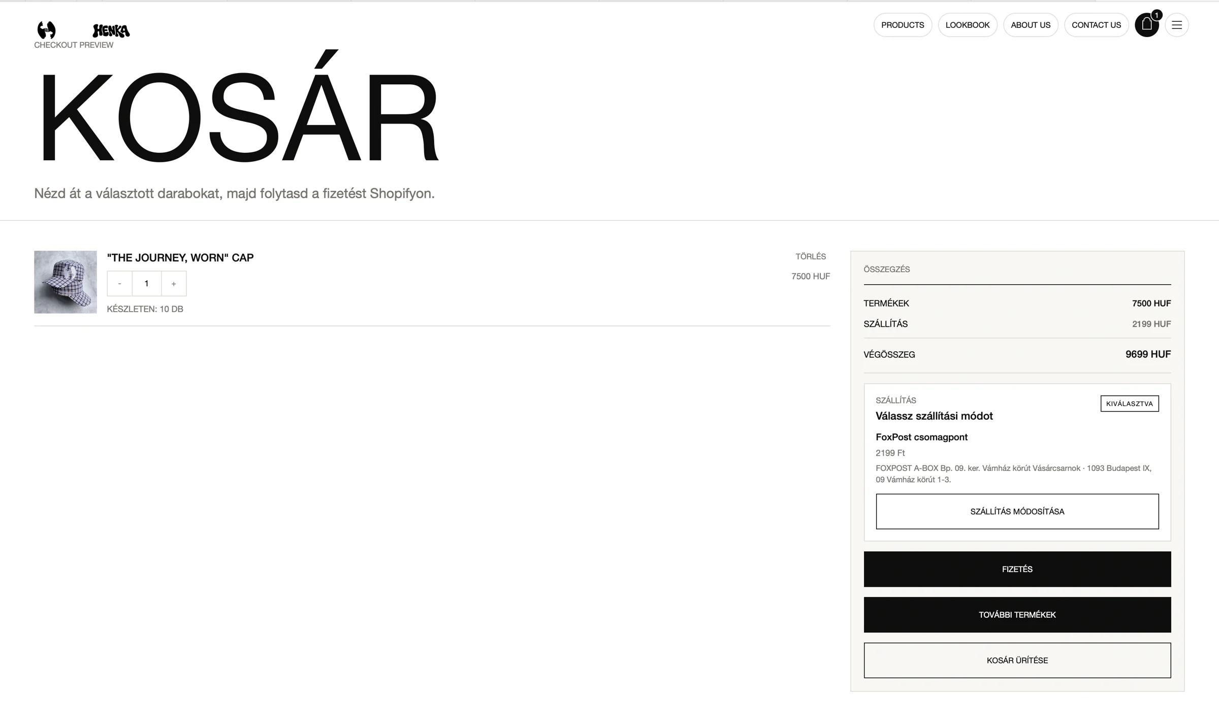
On the Henka page shown, the text below the basket heading also explains that payment continues on Shopify. This can make the change of environment less unexpected when customers reach the next page.
Henka: review and edit in one place
The page shows quantity controls and a remove option beside the product image and name. Prices appear in a separate summary, with an editable delivery method below it. These controls support different tasks involved in reviewing an order.
Both a payment button and a link back to more products are available. Customers can continue with the order or return to browsing without relying on the browser’s back button.
Button hierarchy provides direction too
Alongside labels, size, colour and placement indicate the most important action. In the screenshot, both the payment and continue-shopping buttons have dark backgrounds. One possible test is whether giving the main goal stronger visual emphasis helps people find their way faster.
Emptying the basket serves a different intention, so it should also look distinct from continuing a purchase. With every control, customers should understand the likely result before they click.
Mobile reveals how simple the journey is
On a smaller screen, check the order of elements: products should be easy to review first, followed by the summary and the next step. Quantity controls and delivery editing should remain comfortable to use by touch.
In a short usability test, ask participants to change a quantity, check delivery and proceed to payment. Hesitation and mistaken clicks can reveal where clearer feedback is needed. Assess this alongside the proportion of baskets that reach checkout.
The examples reflect the state shown in the accompanying screenshots. This analysis does not include measured conversion results.